
Alright, let’s talk progress. Week one of this punk-inspired design template project has been messy, scrappy, and way too fun. The vibe? Think DIY zines, basement flyers, and cut-and-paste chaos—but polished just enough that someone could actually use the templates without getting glue on their fingers.
Mood Boards & The Vibe Hunt
I kicked things off with a Pinterest board, and honestly, it’s become the backbone of this whole thing. I’ve been pulling images of torn paper edges, smudged ink, duct tape lettering, and gritty textures that look like they’ve been photocopied one too many times. It’s less “pretty mood board” and more “organized chaos”—which feels very on brand.
Scrolling through it, I can already see how these elements will collide into a full pack of templates. The board keeps me from veering too clean or too digital. It’s my reminder: embrace the mess.


Sketches in the Wild
Alongside the mood board, I’ve got rough sketches happening. These aren’t polished wireframes—they’re scribbles and doodles with big arrows pointing at where type, textures, and graphics might live. Think notebook scrawls, not design-school drafts.
Some sketches focus on layout ideas: how to frame headlines with tape strips, how to layer textures behind text, or where a ripped-paper border might add punch. Others are just me playing with energy—lines slashing across a page, text blocks tilted slightly off-kilter. They’re messy, but they’re sparking ideas for templates that’ll feel alive rather than sterile.


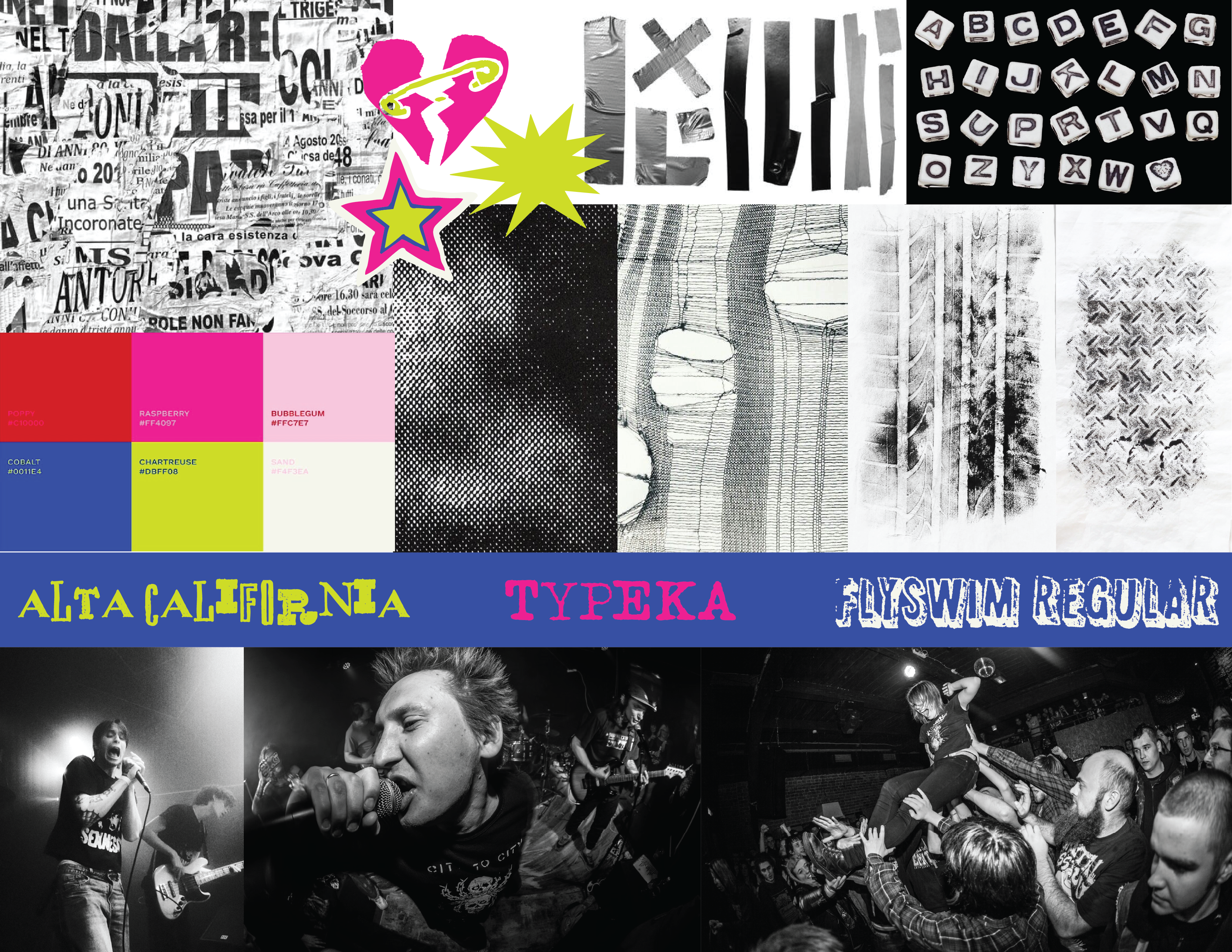
Building the Brand Board
I also pulled together a brand board in Illustrator. Fonts, colors, textures—everything that makes this project feel cohesive without killing the punk spontaneity.
- Fonts: I’m testing combos that scream xeroxed flyer. Blocky sans-serifs with attitude, paired with scratchy, uneven typefaces.
- Colors: Black and white as the foundation (always punk), with pops of neon green, hot pink, and electric blue for contrast.
- Textures: Ripped tights, grainy scans, tire tracks, duct tape strips. These are the glue holding the chaos together.
- Images:
The brand board is like my little survival kit. Whenever I get lost, I can look at it and remember the rules (and when to break them).

Tool Belt of Chaos
Here’s what’s been powering the project so far:
- Pinterest → mood board central.
- Adobe Illustrator → sketches, brand board, layout doodles.
- Adobe Fonts → finding the fonts with the right kind of grit.
- Canva → test-driving how templates will actually work for users.
- My handheld scanner + scraps → scanning textures and making them look delightfully imperfect.
Highlight of the week? That handheld scanner. Feeding scraps through it creates these beautiful, unpredictable results—creases, shadows, grain that digital brushes just can’t fake. I’ve started building a mini texture library this way, and it’s pure gold.
What’s Been Tricky
Punk design thrives on chaos, which means I’ve had to practice restraint. The hardest part is deciding what not to use. Too many textures, and suddenly it’s unreadable. Too few, and it loses the raw vibe. Finding the sweet spot has been the challenge.
Also, some of my scans came out flat at first. They looked too clean, too digital. I fixed that by rescanning at higher resolution and pushing the contrast so the scratches and ink blotches popped. Basically, I had to rough them up until they looked convincingly messy again.
Small Wins & What’s Next
What I’m proud of this week: the vision is solid. Between the Pinterest board, the brand board, and the sketches, I know exactly what direction this project is headed. I don’t feel like I’m guessing anymore—it’s mapped out, even if the map looks like it was scribbled in Sharpie on the back of a flyer.
Next steps:
- Start turning sketches into real layouts in Canva.
- Keep scanning scraps to grow the texture library.
- Experiment more with type pairings—some of them need extra grit.
I’ve started building out my designs, and yes, I’ve been binging YouTube tutorials to make sure I can nail effects like grungy overlays, halftone patterns, and rough paper tears. The goal? Templates that look raw and handmade, but are actually super usable.
Stay tuned—this thing is only getting louder.
Check out my design progress below.
Leave a Reply