

Why This Project Exists
Since discovering the punk scene back in middle school, I’ve always loved the raw, hand-cut, DIY aesthetic. But I noticed something: people trying to make their own end up using overly clean “template packs” that kill the vibe. So I set out to build something that felt real, not polished, for indie designers, musicians, student creators, and small studios.


Project Proposal
Most design templates (especially for posters and event art) lean toward perfection: crisp corners, uniform spacing, clean typography. But punk posters live in distortion, torn edges, photocopy noise, imperfect alignment.
My goal is to build a template system that allows people to drop in their content while maintaining the grit. I’d mix texture, type, and layout rules to preserve that zine aesthetic.
I sketched a plan, broke it into milestones, and decided on a 7-week product development cycle to push a minimum viable set. I wanted to test whether punks would actually use and pay for something like this.
- Created 3 poster templates in Photoshop, each with modules for imagery, text, and layout swaps.
- Built a texture library (overlays: grain, halftone, scratches) that users can toggle on/off.
- Developed typography presets (mix of bold, distressed, tight/loose kerning) to let people plug in band names, dates, etc.
- Launched on Gumroad with teaser visuals, then ran Pinterest ads to gauge interest.
Phase 1: Forming Concepts
I began by searching Pinterest for visual references that captured the raw, DIY energy of punk art—ripped textures, photocopied layers, and bold typography. After collecting ideas, I created a brand board to define the color palette, fonts, and tone of the series. From there, I sketched a few initial layouts to test composition and hierarchy before moving into Photoshop to refine the final designs.


Phase 2: Scribbles to Screens
This stage shifted from concept to creation. I scanned and curated a library of punk textures—torn paper, ink stains, and photocopy grit—to build a toolkit that felt authentic and lived-in. My scanner and Photoshop carried most of the weight, with Lightroom and Illustrator adding polish and order where needed. I also gathered feedback from other designers, who praised the layered structure and suggested adding a simple guide for beginners. Time was the biggest challenge, but completing the first template and refining the process for the next two marked a solid step forward.


Phase 3: Stitchin’ it All Together
The final stretch brought the project to life—all three poster templates were completed and refined into a cohesive design pack. Mixing digital precision with analog grit, I blended scanned textures, photocopy distortions, and hand-drawn details to capture a true DIY punk feel. Once the designs were done, I focused on usability: cleaning up layer organization, labeling assets, and creating a simple ReadMe guide for users. The finished bundle includes three templates, a mini texture library, and editing tips—all prepped for launch on Gumroad. This phase turned raw creative energy into a polished, shareable toolkit ready to hit the marketplace.
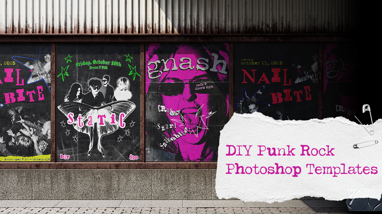
The Gnash poster is my favorite. It looks like something ripped off a telephone pole, but still totally usable for modern promo.
– Sebastian, Digital Artist
“It’s gritty without feeling forced, which is harder than it looks.”
– Vanessa, Graphic Designer
“Each poster has its own vibe, but they still feel like a set, like they belong on the same venue wall after three different shows.”
– Val, Marketing Specialst


Phase 4: Sales Page & Marketing Plan
With the poster pack complete, I built and launched my Gumroad sales page—designing gritty mockups, writing SEO-friendly copy, and showcasing the templates as ready-to-use assets for designers. Then I ran my first paid Pinterest campaign to test how punk design performs on a platform built around perfection. I kept visuals raw and focused the experiment on A/B testing ad titles and descriptions—comparing SEO-driven keywords against bold, attitude-heavy phrasing. An organic pin served as a control to measure engagement honestly. The goal: learn if raw, DIY aesthetics can break through Pinterest’s polished noise and attract an audience from zero.

The Final Numbers
After weeks of design, prep, and setup, the final step was seeing how the Punk Poster Template Pack performed in the wild. I ran two ad groups under one campaign, testing both search-based and attitude-driven titles.
Across all ads, I spent $37.74, reaching 8,540 impressions and generating 39 total clicks. The two “Editable Punk Poster PSD” ads dominated performance with click-through rates hovering around 0.4–0.5%, while the third, “Bold, Loud, and Unfiltered Punk,” had fewer impressions but a stronger visual impact (5 clicks from just 438 impressions).
Compared to my organic pin, which earned 48 impressions and 7 clicks, the paid ads clearly boosted visibility. The reach gap alone shows that even a small ad spend can put a niche creative project in front of the right audience.

Takeaways
Pinterest’s algorithm favors consistency and time. Their documentation recommends running campaigns for at least two weeks to allow ad learning to stabilize and target audiences more accurately. Since my test ran for only one week, these results are an early snapshot rather than the full picture. I also learned that clear, keyword-driven titles helped discoverability more than pure attitude, visibility comes first, then voice.
Next Steps
Test a longer ad window: Pinterest recommends a two-week learning phase to optimize targeting, and my one-week test barely scratched the surface. Extending future campaigns would give the algorithm time to actually find the right creative audience instead of guessing.
Build more pre-launch momentum: instead of jumping straight into ads, I’d seed organic buzz first with teaser pins, texture previews, and behind-the-scenes posts. That would warm up an audience before launch and give ads something to retarget.
Add video: next time, I’ll create short process clips showing the texture scanning, collage layering, and grunge detailing that went into each design. Pinterest favors motion, and it’s the best way to show the craft behind the chaos.
Track deeper metrics: beyond impressions and clicks, I’d connect Gumroad analytics and UTM links to see which pins actually drive sales, saves, and repeat engagement. Punk may thrive on chaos, but the data should still be tight.
And now enjoy my favorite band, Scowl:
Leave a Reply