
Creating a digital tool for Big Sur—a destination known for its natural beauty and tight-knit community—requires thoughtful balance. The app isn’t just for tourists looking for trails and views. It also needs to serve locals whose lives and livelihoods depend on up-to-date, accessible information. Through real user stories and scenarios, we designed an app that’s equal parts practical and welcoming.
User Stories: Voices that Shape the Experience
User stories help identify patterns of need. They simplify complex experiences down to one core objective:
- As a visitor, I want to know which roads are open and which trails are safe so I don’t get stranded.
- As a resident, I want to get alerts if a wildfire starts nearby.
- As a visitor, I want to find dog-friendly beaches or restrooms quickly.
These stories informed the foundation of the app’s structure—bridging everyday needs with timely, location-based information.
User Scenarios: Real People, Real Situations

Here’s how those stories translate into real usage:
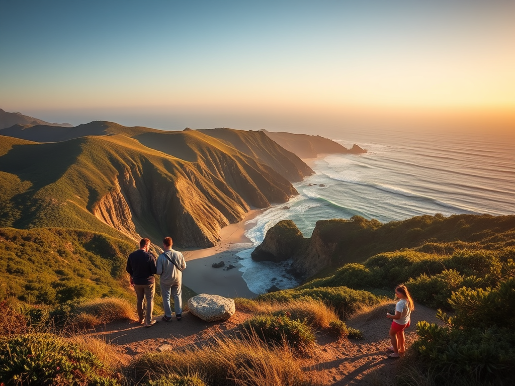
Sarah is a weekend visitor to Big Sur.
She and her partner are in town for a hiking trip and want to know which trails are open and if Highway 1 has any closures. Because cell service is limited, Sarah expects the app to show offline-accessible trail maps, current road conditions, and alternate routes. She also wants real-time alerts so they can avoid unexpected detours. Quick access to trailhead info and safety tips is important to her for planning and peace of mind.
Daniel is a long-time resident of Big Sur.
Living in a wildfire-prone area, Daniel needs immediate emergency alerts. He works from home and prefers notifications sent directly to his phone. He also wants to check current fire status and evacuation zones in-app. The app must provide timely, trustworthy information that helps him act fast when threats arise. Having a central, local source of updates helps him feel secure.
Emily is a traveler exploring Big Sur with her dog, Luna.
She wants to explore trails, beaches, and parks that allow dogs. With limited time and changing rules, Emily expects the app to filter pet-friendly locations, highlight leash laws, and show nearby amenities like waste stations and dog-friendly stops. She also wants to save favorites for quick access. The app should make her trip easier by giving clear, reliable information on where Luna is welcome.
Each of these scenarios emphasizes a key design goal: make relevant information easy to find and act on, no matter who’s using the app or why.
Use Cases: What Users Actually Do
These everyday goals break down into specific, testable tasks:
Use Case: Check Traffic Conditions
- Open the app.
- Tap “Travel” from the home screen.
- View road closures and delays.
- Decide if an alternate route is needed.
- (Optional) Enable push notifications for real-time updates.
Use Case: Save an Event
- Navigate to “Events.”
- Scroll through or filter by date/category.
- Tap the event card for details.
- Tap “Save to Calendar.”
- Set a reminder if desired.
These use cases reflect the rhythm of life in Big Sur—both the everyday and the exceptional.
User Flow: Visualizing the Journey


Whether you’re a resident like Daniel or a first-time visitor like Emily and Sarah, the user flow is designed to guide you naturally:
- Open the app →
- Select your goal (Explore, Events, Travel, Residents) →
- Filter or search as needed →
- View relevant content →
- Save, share, or act on the information.
The flow is seamless, requiring minimal steps and supporting low-data environments—essential for a place like Big Sur where reception can be limited.
One Community, Two Audiences, One App
Big Sur’s app is built for all who pass through—whether for a weekend or a lifetime. It meets users where they are, respects their time, and helps them connect to the land, the town, and each other.
By grounding our design process in authentic user scenarios and flows, we’ve created an experience that feels local, even when you’re just visiting.
Leave a Reply