
What Is Paper Prototyping?
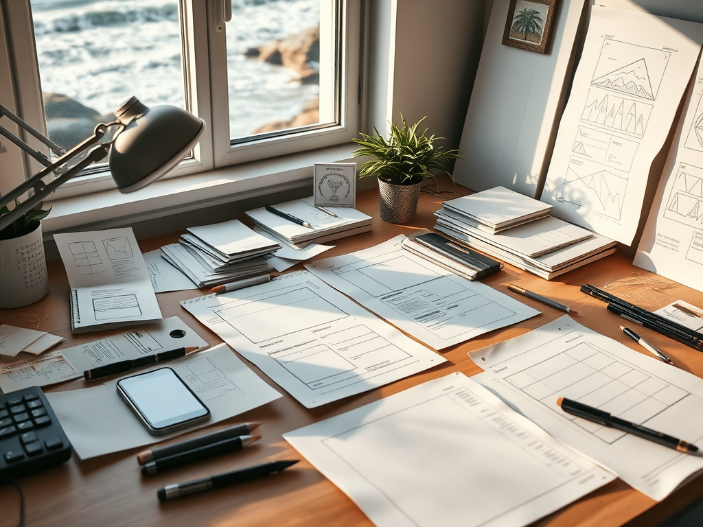
Paper prototyping is a design method where you sketch out your app or website on paper to explore how it should work before you build anything digital. No code, no mock-ups. Just quick, low-pressure drawings that help you think through layout, flow, and interaction.
It’s an early step in the design process, and that’s exactly what makes it powerful. Paper prototypes help you focus on structure before visuals, user needs before polish. Designers use it to explore ideas, spot flaws, and test flows quickly, without sinking time into design software or getting too attached to aesthetics too soon.
It’s a form of problem-solving that invites iteration. You can cross things out, redraw them, rearrange ideas in minutes. And because it’s so low-stakes, it’s easier to experiment, make mistakes, and fix them before they cost you hours of work later.
For my Big Sur Companion app a project that needed to balance utility, clarity, and calm. Paper prototyping was the foundation.
Designing with Care, Not Just Speed
The moment I began imagining the Big Sur Companion app, I had a clear goal: create a tool that helps travelers explore California’s most iconic stretch of coastline with ease and confidence, without losing the joy of the journey to cluttered apps or endless tabs. I wanted the app to serve both visitors and locals delivering road updates, events, destinations, and emergency info, all without overwhelming the user.
But before I ever opened a design tool, I slowed down and reached for pen and paper.
That choice turned out to be more than just a placeholder step. It was the most valuable part of the design process.
Mapping Out Everyday Needs

When I began sketching the Big Sur Companion app, I wasn’t drawing to decorate. I was drawing to understand.
I laid out a homepage first — one that felt calm and organized, not busy or overwhelming. It needed to serve a wide range of users: a tourist looking for beaches, a local looking for road closures, a hiker curious about the day’s conditions. On paper, the homepage sorted itself naturally into sections: Road Conditions, Events, Explore, Featured Destinations, and Community News.
Sketching these by hand let me see the hierarchy of the information at a glance — what needed to be prominent, and what could sit quietly until needed. It wasn’t about filling space; it was about making space for the user’s priorities.
From Calendar Flow to Event Detail
The Events page came next. I sketched out a month calendar view with stars to mark days with upcoming events. Each star would be clickable, popping up details like event title, time, and place. Two actions followed: RSVP and add to calendar — both linking externally to keep the app lightweight.
Even something this simple raised useful questions: Is the event detail pop-up too crowded? Should the RSVP link always open in a browser, or could it integrate with system calendars? By sketching first, I could test these flows without investing time in interactive components or UI styling.

Designing for Real-World Problems
The next screen I tackled was Road Conditions — something critical for a place like Big Sur, where landslides, washouts, and closures aren’t rare, they’re expected. This page needed to balance clarity with urgency.
I drew a list of active closures first, then an interactive map for spatial context. Alternate routes would be offered where possible. Then I added another small but vital feature: a signup for alerts — offering push notifications for road closures, landslides, fire warnings, and weather conditions.
The sketches helped me see this system as more than a page of data — it was a safety feature. And the design needed to respect the user’s time and stress level. A clear, clean alert; a direct path to the Road Conditions page. No extra screens, no clutter.
Even the simplest notification — like a landslide alert with two choices: OK or More Info — was born from sketching out the user’s moment of need. I wanted to offer reassurance, not noise.

Exploring Without Overwhelm
For the Explore page, I knew I wanted the app to feel welcoming to newcomers, not just seasoned hikers or locals. I laid out image-based cards for Beaches, Hiking Trails, State Parks, Scenic Spots, and Camping — each acting as a doorway to an interactive map tagged with locations.
From there, the real design thinking happened: filtering. The sketches made it clear that different users would have different needs. A family traveling with pets might need dog-friendly beaches. A person with accessibility needs might want to filter for wheelchair-accessible trails. Someone traveling light might prefer hike-in only campsites.
Sketching the filtering process let me focus on logic before appearance. How would users ask for what they need? What’s the least complicated path from curiosity to discovery?

Designing for Locals, Too
Not every app feature is about the tourist experience. Big Sur is a living community, not just a postcard. I wanted the Residents section to reflect that.
On paper, I sketched the Residents menu into four parts: Community News, Public Services, Alerts, and Emergency Contacts. Community News would link out to local stories. Public Services would list waste management, community centers, and safety contacts. Alerts and emergency resources would offer real-time updates for fires, road conditions, and more.
The sketches helped me balance two different audiences: visitors who wanted recommendations and residents who needed reliable, official information.
Rethinking the Navigation Menu
Even the menu at the bottom of the screen wasn’t rushed. On paper, it was easier to see what truly mattered: Home, Events, Travel, and Residents.
Each menu item reflected a different way of approaching the region. Travelers might want an itinerary. Locals might want real-time alerts. Event seekers might be visiting on a tight schedule. Sketching these pathways helped me avoid stuffing too much into a single screen or forcing too much scrolling — both common mistakes when you skip ahead to polished mock-ups.
From Paper to Purpose
Sketching these ideas wasn’t about aesthetics — it was about understanding intent. Each section of the app had to earn its place, and each flow had to solve a real-world problem.
That’s the heart of low-fidelity prototyping: the chance to design with care before you design with polish.
On paper, I could make changes in seconds. I could flip back to an earlier idea without regret. I could catch problems while they were still small. I could ask questions I might have skipped otherwise:
- What does the user need first?
- What can the app quietly handle in the background?
- How do I help the user get back to their trip rather than linger in the app?
And because the sketches were rough, sharing them with friends and peers invited honest feedback — the kind that disappears when you present something too finished, too early.
Design as Quiet Problem Solving
For me, paper prototyping wasn’t just about organizing screens. It was about stepping into the mindset of the person using the app.
Design isn’t about adding features until it feels “complete.” It’s about subtracting anything that gets in the way of clarity, comfort, and ease. And that’s easier to do when your ideas are sketched on paper rather than locked into layers and grids.
The Big Sur Companion app is still in development. The code will come later, the polish will come last. But thanks to low-fidelity prototyping, the structure is already thoughtful, intentional, and tuned to real-world needs.
When you begin a design project, starting with sketches isn’t just about saving time — it’s about showing your future users that you’ve taken the time to think.
Leave a Reply